Development & Production
New Logo

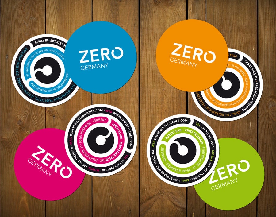
Hi guys, as you may have noticed, we made a change on the logo. Better now before it’s too late, right? This version should look more universal, more professional, and less sportive. After some discussion we came to the conclusion that we couldn’t imagine other watch models, or even other products carrying the old logo type because it was too special in some way. We also removed the word “watches”, because who knows where all this leads to, maybe we want to produce other things than watches some day. The swirl will definately stay – not in the logo, but it will serve as an eye-catcher. Well, I hope you like the new creation! Here’s a comparison and the new logo in use on our business cards (which are not printed yet).
Dont know, really like the original logo maybe i just got use to it still, the new one definately more proffesional and sharp. loving the whole concept of watching the step by step process. Fantastic product
argh… can I order one already? =P
This watch is just too beautifull.
Robert, the changes you made had been very good! But keep up with the swirl, because it’s really very eye-catching and will firm you as a great and original brand.
I’m accompanying your work, too, and waiting for more news!
I wish a lot of success in your journey! 😀
thanks 🙂
hehe, the watch is still in production Marlies. The only real thing we got into our hands so far is the silicone mould of the strap (which looks good) – everything else isn’t finished yet.
the blue swirl will be used on different occasions, like on the packaging for example.